No, packaging design is not business as usual for me.
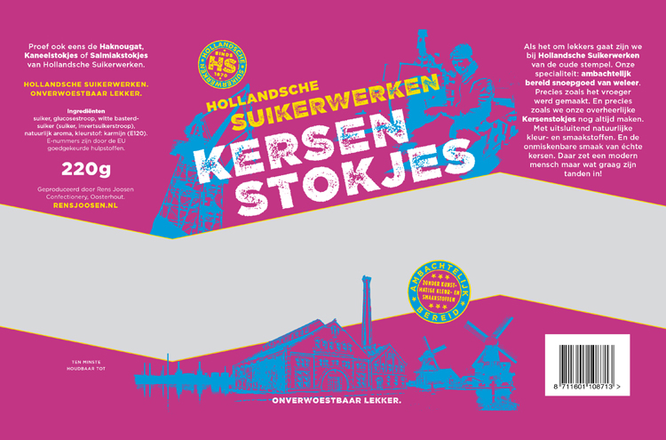
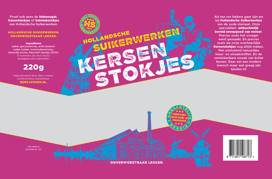
But when Rens Joosen Suikerwerken, a sugar factory from the Dutch province of Brabant, commissioned a re-branding of it’s line of classic sweets, graphic designer Rutger Fuchs and me took to the job with gusto.
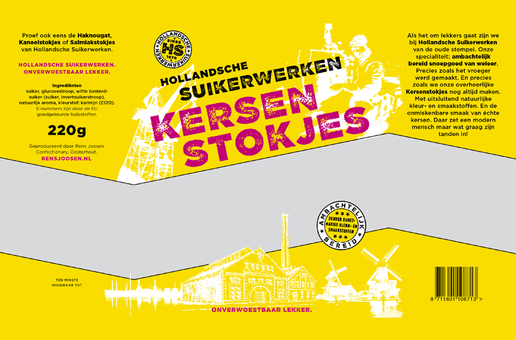
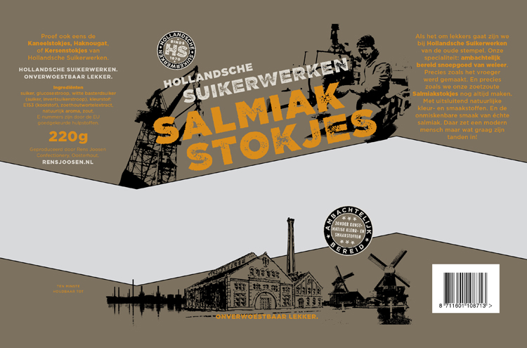
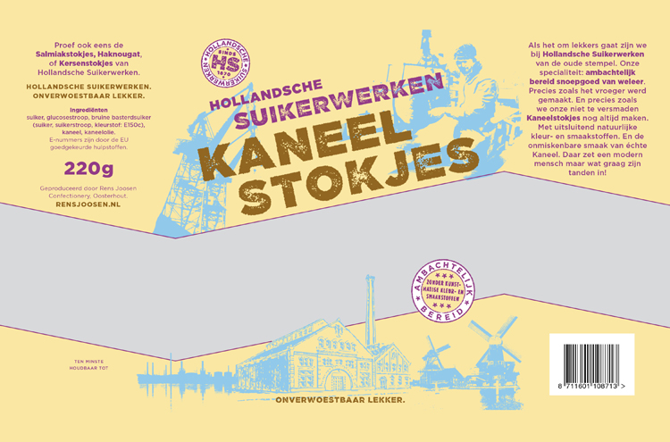
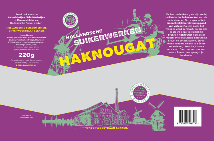
First we came up with the name Hollandsche Suikerwerken – Dutch Confectionary (old spelling) – which is rather generic and old-fashioned, which in turn is good, because it sounds like the factory has always been there, like an inalienable piece of the country’s industrial patrimony.
After that, we evoked, through the canvas of packaging, the iconic industrial images of old. And then… well, then the factory went bust.
But we still love the packaging!
Credits
Clients – Rens Joosen Suikerwerken. Concept / design: Rutger Fuchs. Concept / copy: Olaf Zwetsloot.